

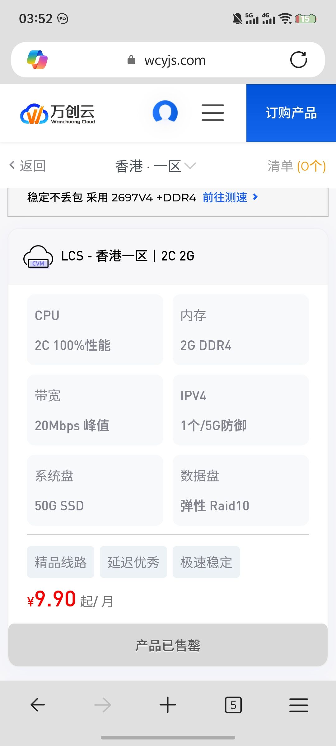
示例
增加卡片圆角/左上角图标
增加底部蓝色扫光/悬停放大
教学
1.登录速科模板后台
2.依次点击实用插件-全局文件-购物车CSS
3.将以下提供的CSS代码复制粘贴进去即可
CSS代码:
p.stock-info {
  display: none;
}

.product-card {
    border-radius: 12px;
    overflow: hidden;
}

.product-card-header {
    border-radius: 12px 12px 0 0;
}

.product-Parameters {
    border-radius: 0 0 12px 12px;
}

.tisuyun_bq {
    border-radius: 6px;
}

.buy-now-button {
    border-radius: 6px;
}

/* 交互效果 */
.product-card {
    transition: transform 0.3s ease, box-shadow 0.3s ease;
}

.product-card:hover {
    transform: translateY(-4px);
    box-shadow: 0 8px 24px rgba(0, 0, 0, 0.12);
}

.buy-now-button {
    transition: all 0.3s ease;
}

.buy-now-button:hover {
    opacity: 0.9;
}

.buy-now-button:active {
    transform: translateY(1px);
}

.price {
    transition: transform 0.3s ease;
}

.product-card:hover .price {
    transform: scale(1.1);
}

.header-title h5::before {
    content: '';
    display: inline-block;
    width: 32px;
    height: 32px;
    margin-right: 8px;
    vertical-align: middle;
    background-image: url("/themes/web/www/static/icon/CVM.png");
    background-size: contain;
    background-repeat: no-repeat;
    background-position: center;
}

/* 新增UI优化 */
.product-card {
    border: 1px solid #f0f0f0;
    transition: transform 0.3s ease, box-shadow 0.3s ease, border-color 0.3s ease;
}

.product-card:hover {
    border-color: #d0d0d0;
}

.amount {
    font-weight: 700;
}

.tisuyun_bq {
    transition: opacity 0.3s ease, transform 0.2s ease;
}

.tisuyun_bq:hover {
    opacity: 0.8;
    transform: translateY(-1px);
}

.tisuyun_adv {
    transition: all 0.3s ease;
}

.tisuyun_adv:hover {
    background: #0008ff;
    color: #fff !important;
}

.header-title h5::before {
    transition: transform 0.3s ease;
}

.product-card:hover .header-title h5::before {
    transform: rotate(5deg);
}

.buy-now-button:hover {
    opacity: 0.9;
    transform: translateY(-1px);
}

/* 产品描述文字优化 */
.product-description {
    transition: color 0.3s ease;
}

.product-card:hover .product-description {
    color: #333;
}


/* 卡片加载动画 */
@keyframes cardFadeIn {
    from {
        opacity: 0;
        transform: translateY(20px);
    }
    to {
        opacity: 1;
        transform: translateY(0);
    }
}

.product-card {
    animation: cardFadeIn 0.6s ease-out;
}

/* 价格跳动效果 */
@keyframes priceGlow {
    0%, 100% {
        text-shadow: none;
    }
    50% {
        text-shadow: 0 0 8px rgba(231, 76, 60, 0.3);
    }
}

.product-card:hover .amount {
    animation: priceGlow 2s ease-in-out infinite;
}

/* 按钮微光扫过效果 */
.buy-now-button {
    position: relative;
    overflow: hidden;
}

.buy-now-button::before {
    content: '';
    position: absolute;
    top: 0;
    left: -100%;
    width: 100%;
    height: 100%;
    background: linear-gradient(90deg, transparent, rgba(255,255,255,0.2), transparent);
    transition: left 0.8s ease;
}

.buy-now-button:hover::before {
    left: 100%;
}

/* 标签组微弹跳 */
.product-card:hover .tisuyun_bq:nth-child(1) {
    transition-delay: 0.1s;
}

.product-card:hover .tisuyun_bq:nth-child(2) {
    transition-delay: 0.2s;
}

.product-card:hover .tisuyun_bq:nth-child(3) {
    transition-delay: 0.3s;
}

/* 卡片内容轻微放大 */
.product-card:hover .product-card-body {
    transform: scale(1.02);
    transition: transform 0.3s ease;
}

/* HR线条动画 */
hr {
    position: relative;
    overflow: hidden;
}

hr::after {
    content: '';
    position: absolute;
    top: 0;
    left: -100%;
    width: 100%;
    height: 1px;
    background: linear-gradient(90deg, transparent, #667eea, transparent);
    transition: left 0.8s ease;
}

.product-card:hover hr::after {
    left: 100%;
}

/* 微妙的焦点指示器 */
.product-card:focus-within {
    outline: 2px solid rgba(102, 126, 234, 0.3);
    outline-offset: 2px;
}
图片修改教程
左上角图片需将以下路径修改成你的
/themes/web/www/static/icon/CVM.png© 版权声明
THE END


暂无评论内容